Make the problem tangible
Rather than leading with generic agency messaging, the experience frames outdated design as a business problem: lost attention, trust, inquiries, and customers.
A conversion-focused website for a web design studio.
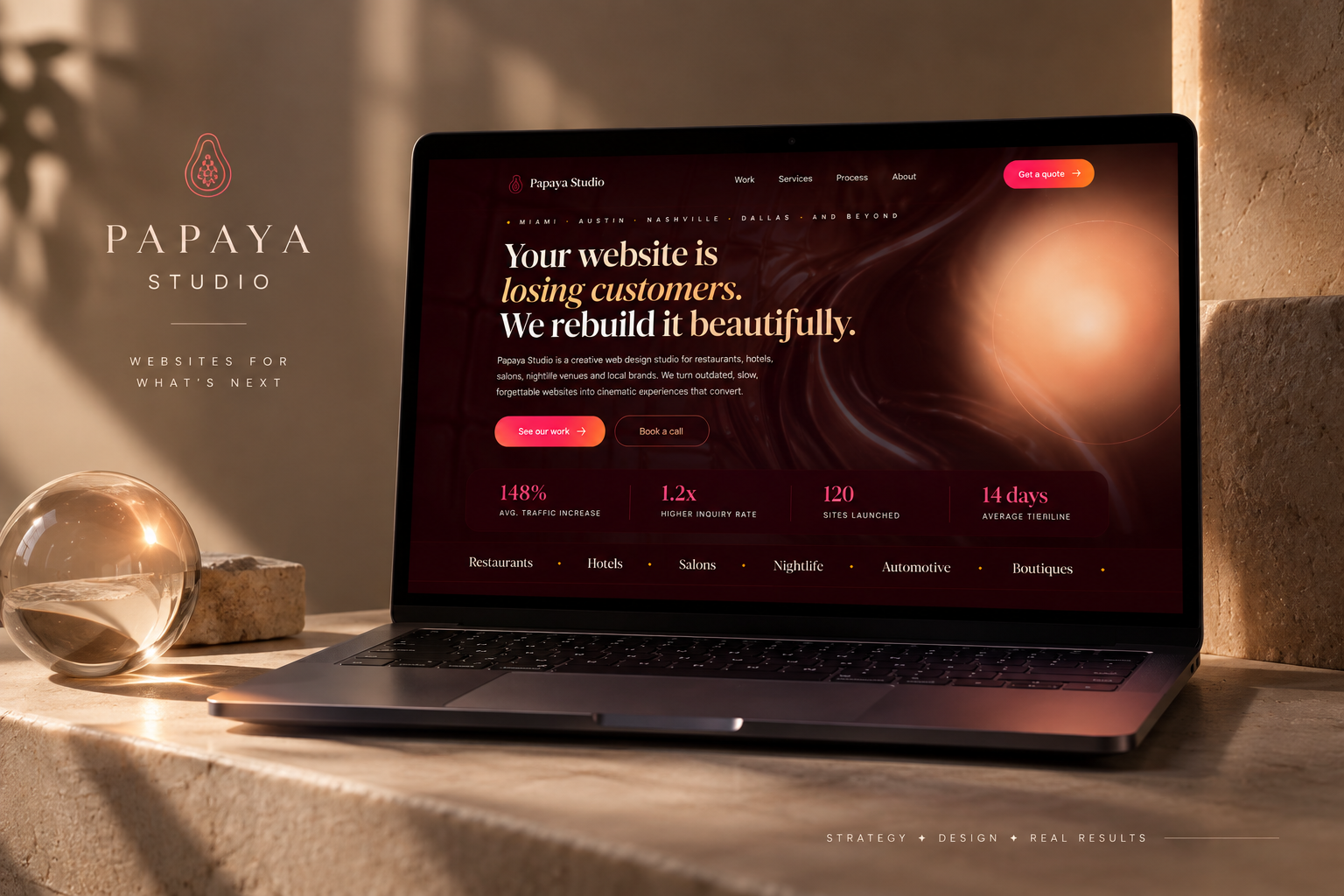
Brand design · UX/UI · Conversion strategy · AI-assisted development
Papaya Studio is a personal project exploring how a web design studio could turn its own website into a sales tool. I designed the brand, website experience, messaging, and lead-intake flow around one goal: help potential clients understand the value of a redesign and make it easy to take the next step.
The idea
Small businesses often know their website feels outdated, but they don’t necessarily understand what it’s costing them or what a redesign would actually change.
Instead of positioning Papaya Studio as another portfolio of pretty websites, I wanted the experience to connect design directly to business outcomes.
The challenge
How might I turn a web design portfolio into a conversion experience that helps business owners recognize a problem, understand the value of redesigning, and take action?
That question shaped the site’s messaging, information hierarchy, service presentation, and booking experience.
Design strategy
Rather than leading with generic agency messaging, the experience frames outdated design as a business problem: lost attention, trust, inquiries, and customers.
Visual redesign examples let visitors immediately understand the transformation Papaya Studio offers instead of relying entirely on service descriptions.
Instead of immediately asking someone to schedule a call, the site offers a free redesign preview and collects project information through a short guided flow.
The website experience
The homepage moves visitors through a deliberate narrative: identify the problem, visualize the transformation, understand the services and process, build trust, answer objections, and finally convert.
Instead of treating each section independently, I designed the page as a continuous sales journey.
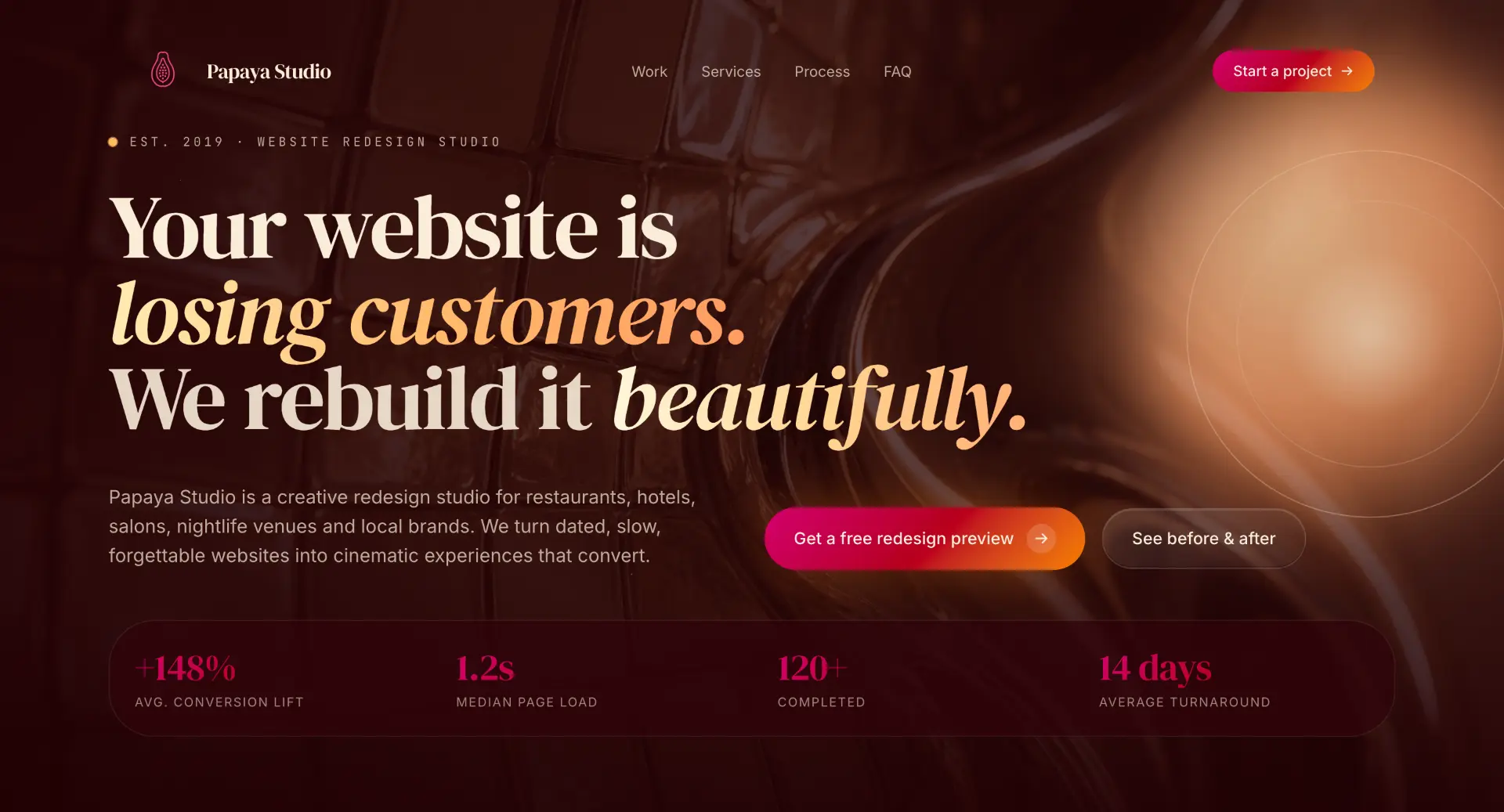
The hero immediately communicates the business consequence of an underperforming website.
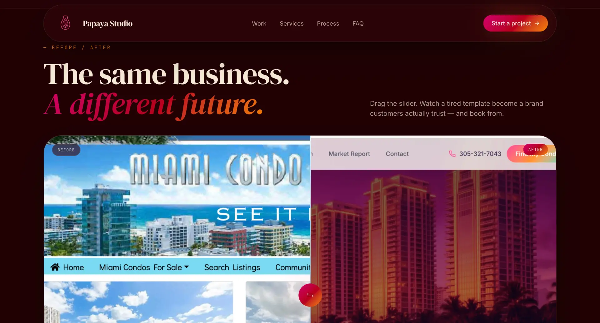
Before-and-after redesigns demonstrate the service before asking visitors to commit.
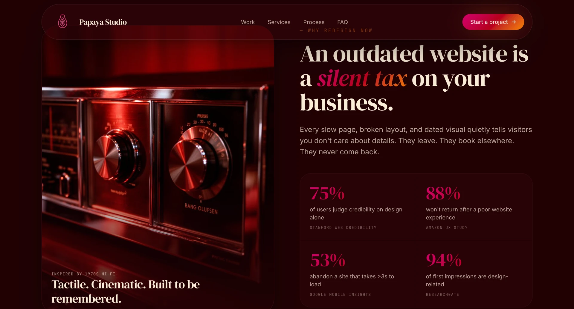
Supporting statistics connect website performance and design decisions to customer behavior.
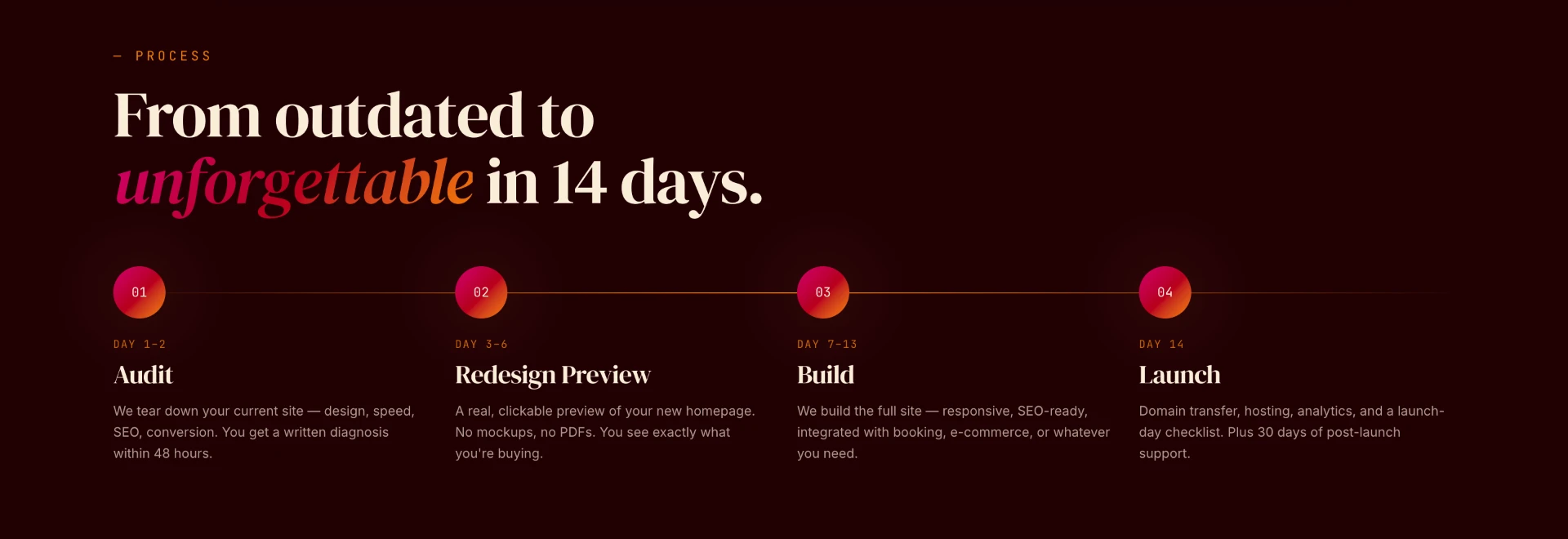
The four-step process makes the service feel predictable and easier to understand.
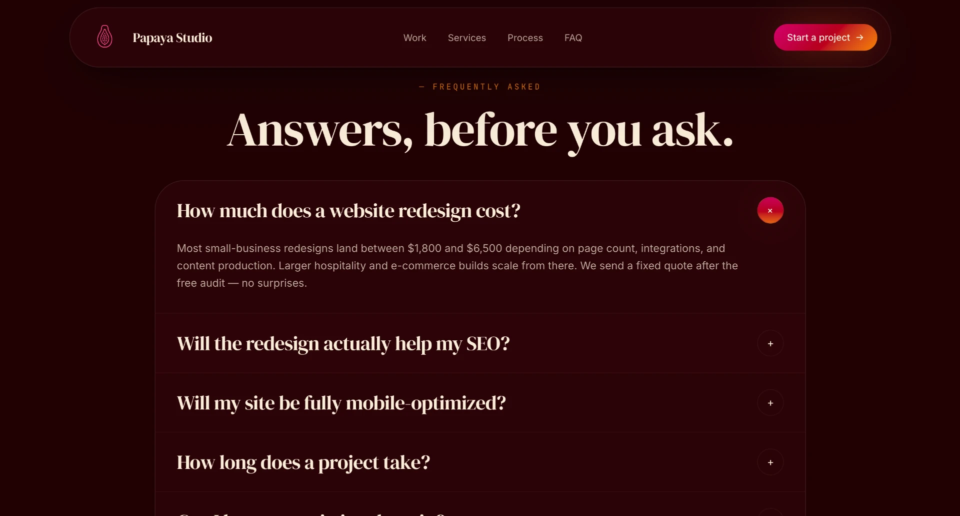
FAQs address common concerns around SEO, mobile optimization, timelines, domains, hosting, and ongoing support.
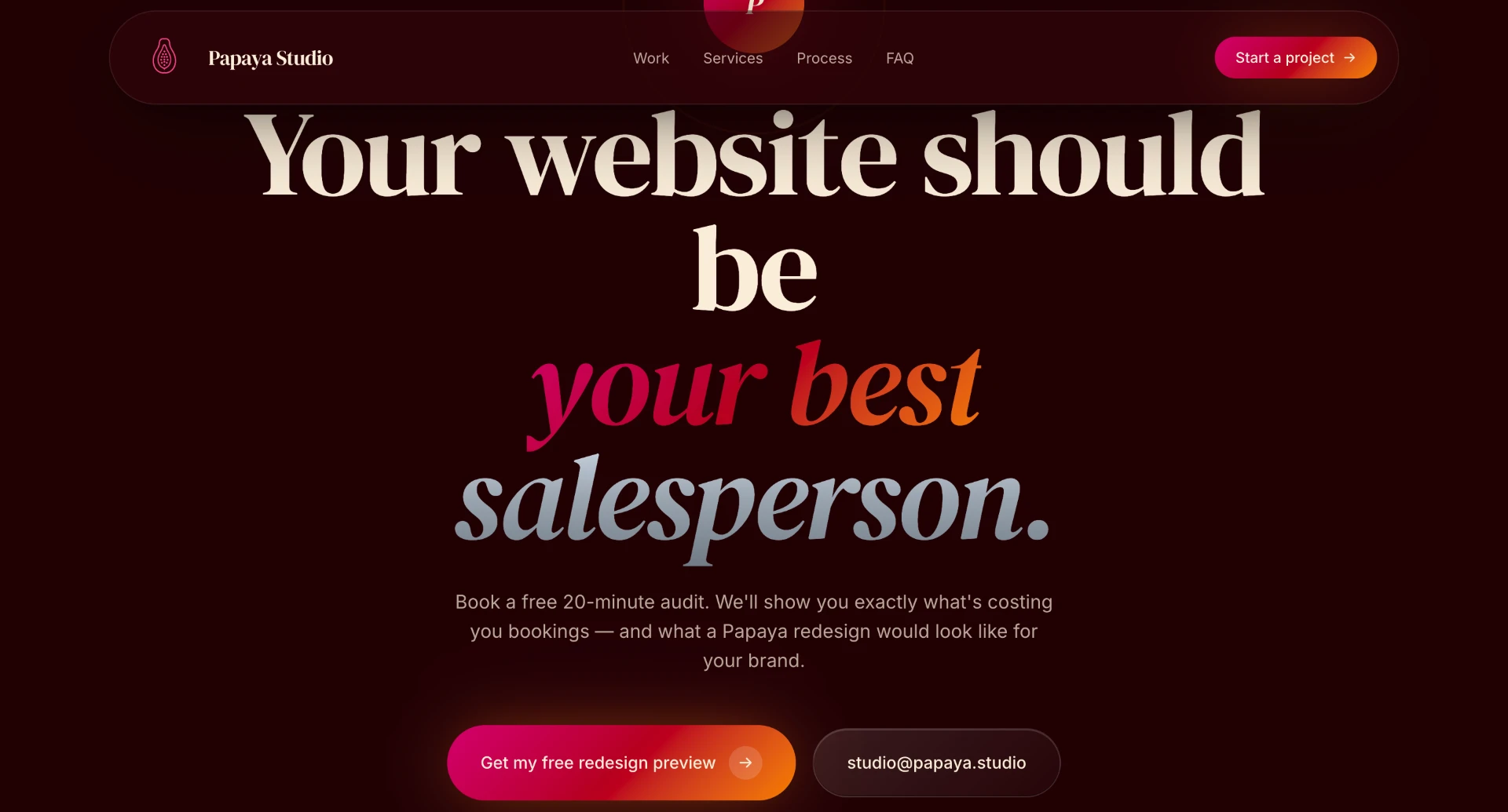
Calls to action appear throughout the experience without requiring visitors to commit to a sales call immediately.
From visitor to qualified lead
Rather than sending every visitor directly to a generic contact form, I designed a four-step intake experience around the information needed to understand the project before responding.
Breaking the form into smaller steps reduces the amount of information presented at once while progressively qualifying the lead.
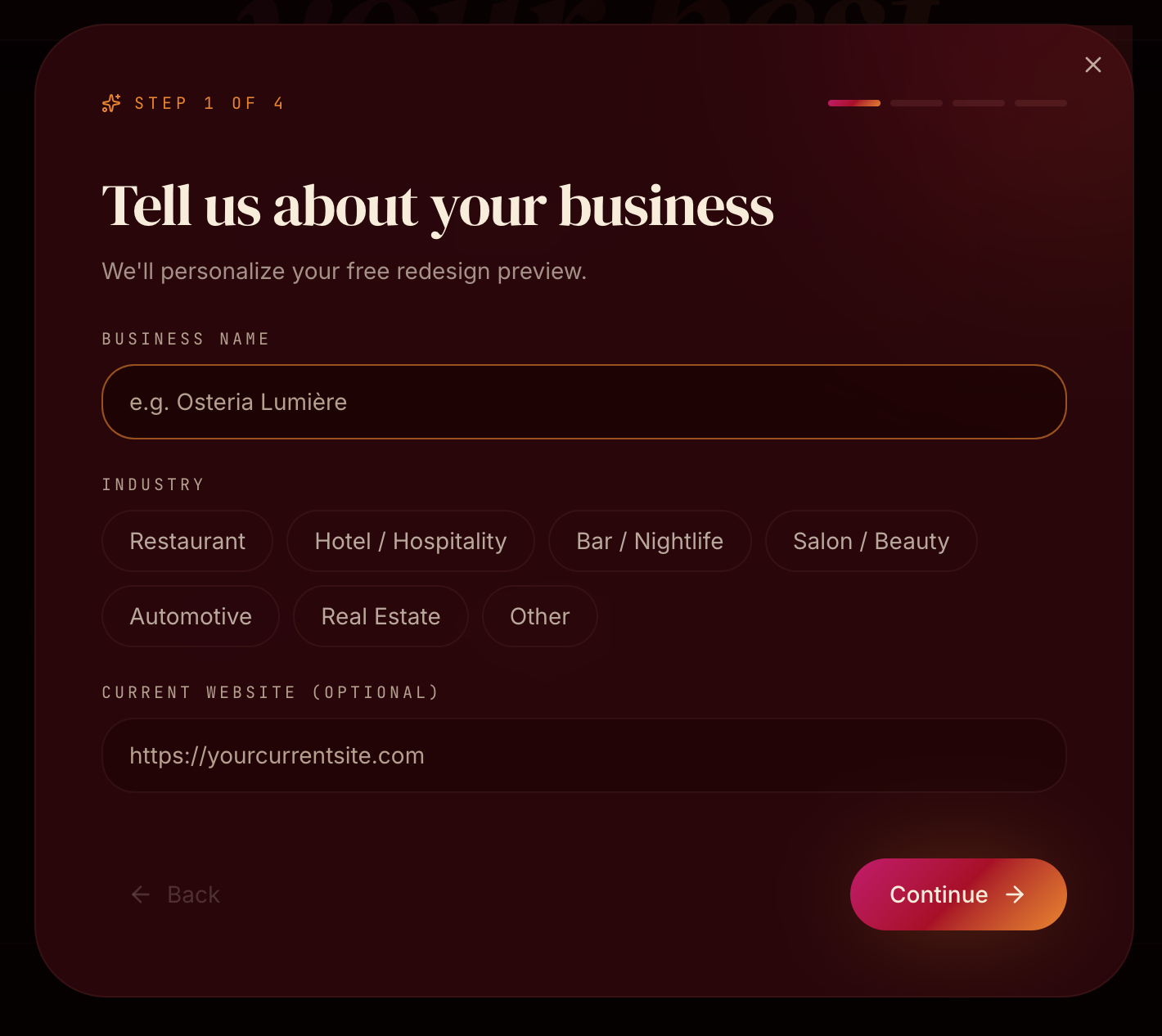
Business context first
The flow begins with the minimum information needed to understand the prospect: business name, industry, and current website.
Industry selections make common answers faster while still allowing businesses outside Papaya Studio’s primary categories to continue.
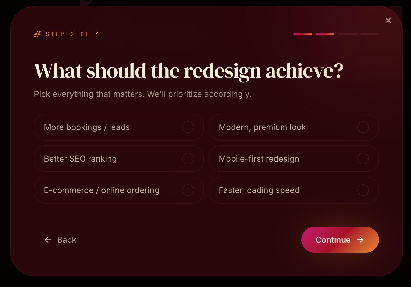
Design around outcomes, not deliverables
Instead of asking clients what pages or features they want immediately, the second step asks what they want the redesign to accomplish.
Visitors can identify priorities such as more bookings, stronger SEO, a premium visual identity, mobile optimization, e-commerce, or improved performance. This gives the designer context around why the project exists before defining what should be built.
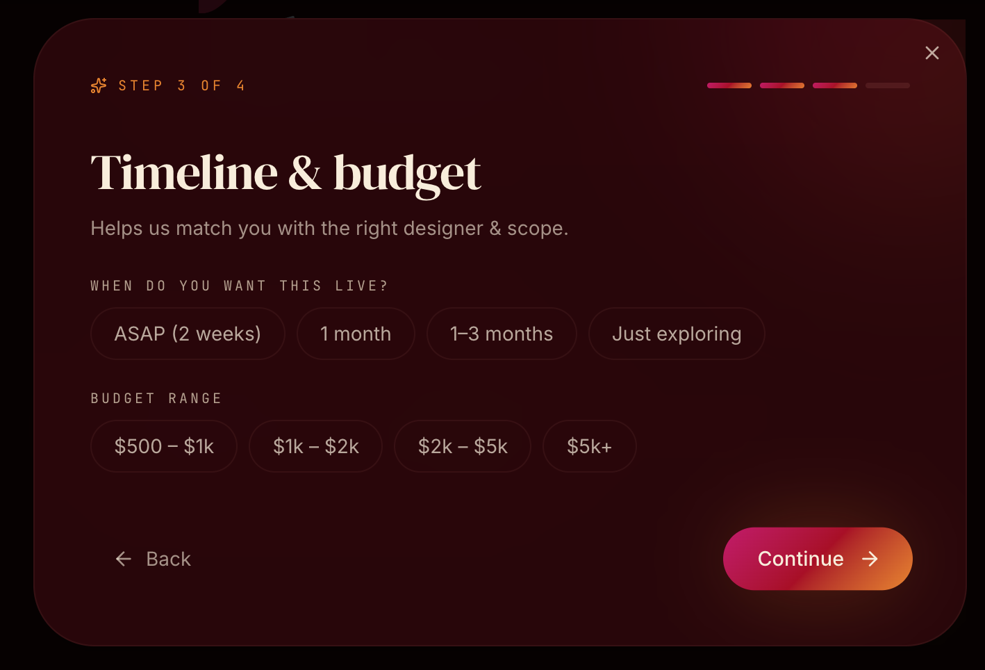
Set expectations early
Timeline and budget are collected before contact information so project fit can be understood without requiring a discovery call first.
Selectable ranges make potentially uncomfortable questions easier to answer and help establish scope before the inquiry reaches the studio.
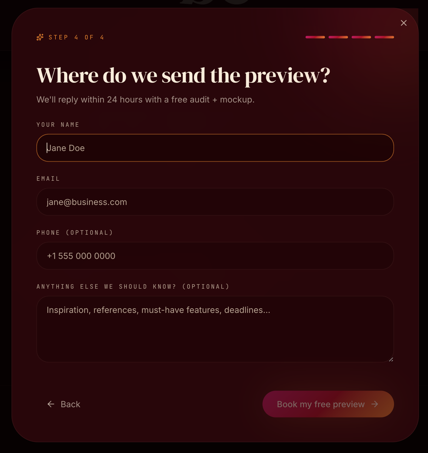
Ask for contact information last
Only after the visitor has described their business, goals, timeline, and budget does the experience request contact information.
An optional open-ended field gives users space to share references, must-have features, deadlines, or context that didn’t fit the structured questions.
Why a multi-step flow?
A traditional contact form places every question in front of the user simultaneously. I separated the experience into four focused decisions, using visible progress indicators and selectable answers wherever possible.
The goal was to balance two needs: keep the inquiry experience lightweight for the visitor while collecting enough information for the studio to respond meaningfully.
Only information relevant to the current step is shown.
Selectable goals, industries, timelines, and budgets reduce typing.
A persistent four-step indicator tells users exactly where they are and how much remains.
Visual direction
Papaya Studio’s visual system was designed around the businesses the studio targets: hospitality, restaurants, nightlife, beauty, and other visually driven local brands.
Deep burgundy backgrounds, warm cream typography, editorial serif type, vivid pink-to-orange gradients, and cinematic imagery create an identity that feels expressive and premium while still functioning as a service website.
High-contrast serif headlines create personality and hierarchy.
Burgundy and cream create a more elevated alternative to traditional agency black-and-white.
Pink and orange are reserved for interactive moments and important calls to action.

Rich photography reinforces the type of visual transformation the studio sells.
Key product decisions
I positioned the homepage around what an outdated website costs a business rather than opening with a description of Papaya Studio.
Redesign examples appear early so visitors can see the potential outcome before reading through services or pricing.
Messaging connects design decisions to customer trust, inquiries, bookings, performance, and discoverability.
The four-step intake experience collects business context and project fit while keeping each interaction focused.
Contact information appears at the end of the flow, after the user has already invested in describing the project.
What I learned
Papaya Studio pushed me beyond designing individual screens and into thinking about how an entire website supports a business objective.
The biggest shift was designing the experience as a sequence rather than a collection of sections. Every interaction needed to answer a different question for the visitor: Why does this matter? What could my website become? What does the studio actually do? Can I trust the process? What happens if I’m interested?
Designing the intake flow reinforced the same principle on a smaller scale: asking for less information at each moment can create a smoother experience while still producing a more useful result for the business.
The connection to Papaya Pro
Building Papaya Studio exposed another challenge: designing websites wasn't the hardest part of running a small studio—consistently finding, evaluating, contacting, and following up with potential clients was.
That problem became the foundation for my next project, Papaya Pro, a sales workspace designed specifically for freelance web designers and small agencies.
Papaya Studio explored the customer-facing sales experience. Papaya Pro explores the system behind it.