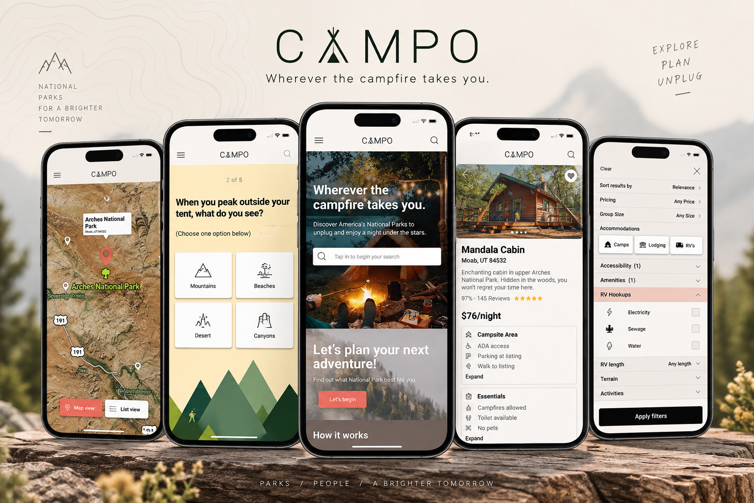
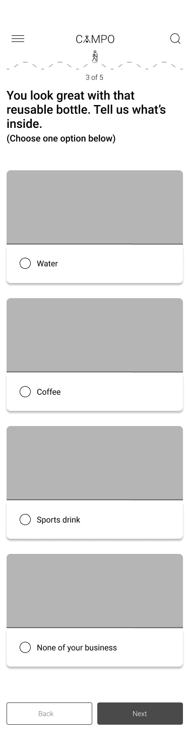
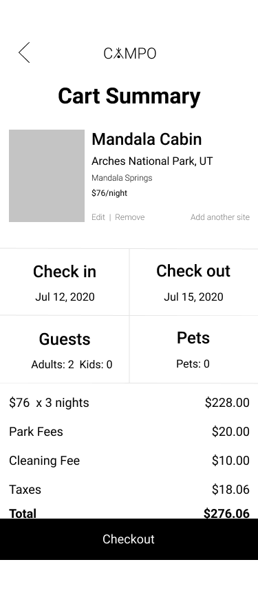
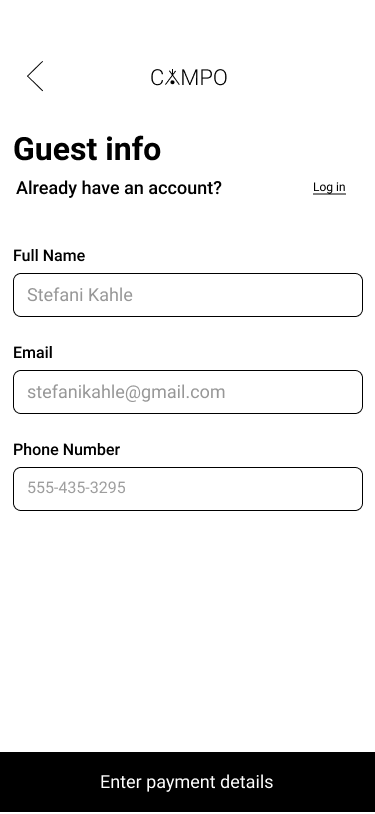
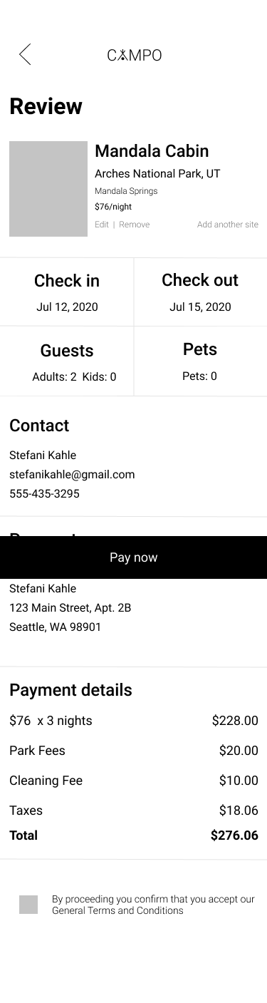
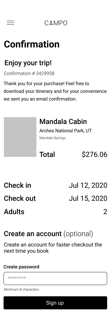
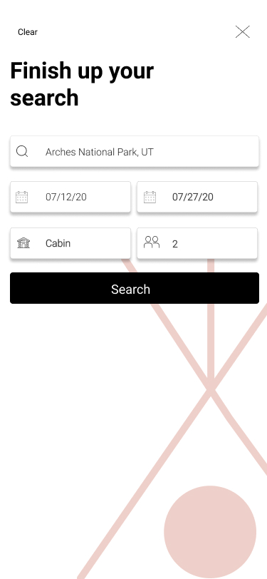
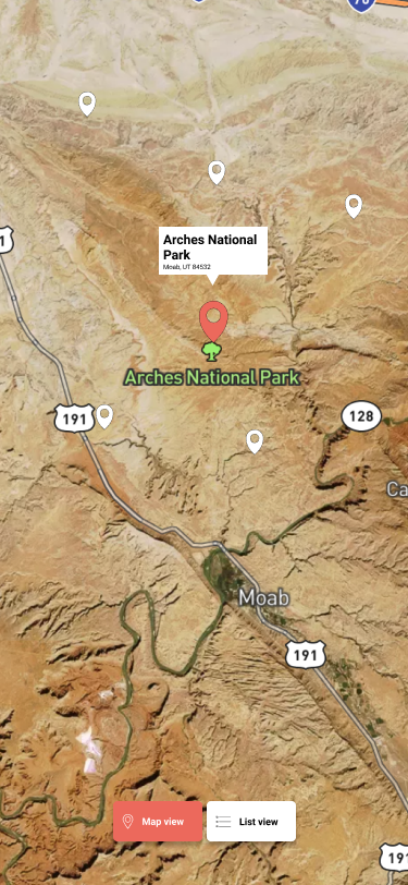
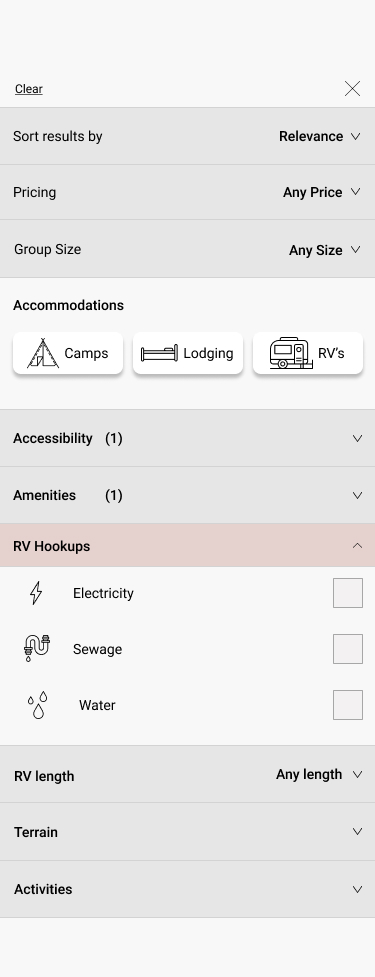
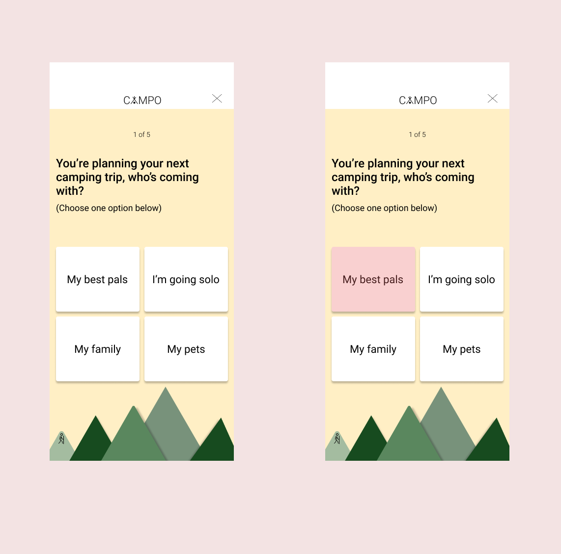
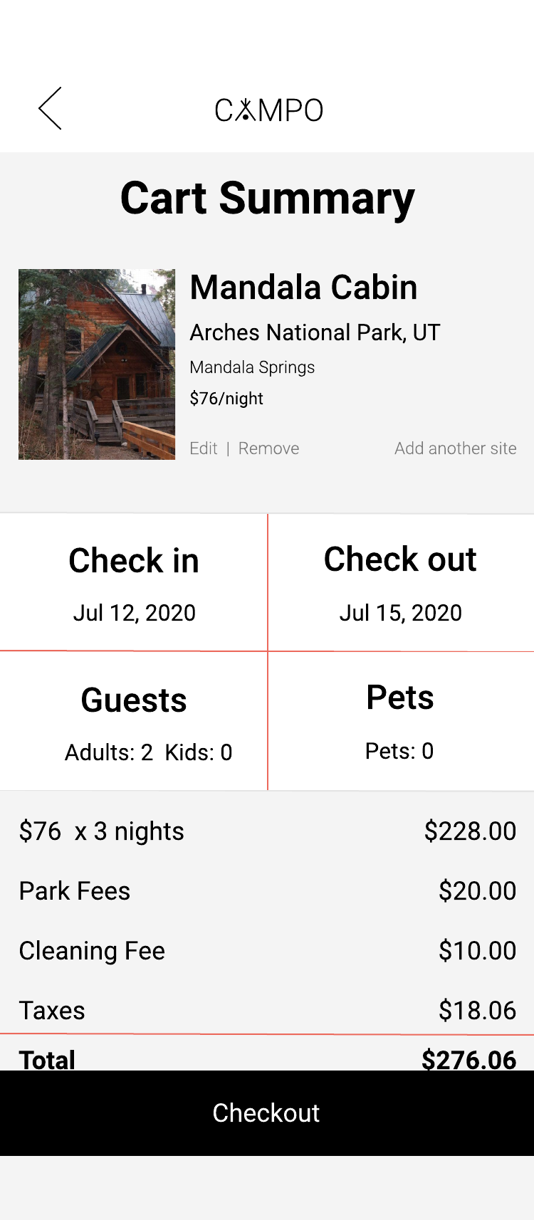
If I were designing CAMPO today, I would simplify several interactions and establish a more consistent design system earlier in the process. I’d also approach the color system with a more refined eye. Looking back, some of the neutral tones—particularly within the filters and supporting UI—read much darker and heavier than I intended. At the time, I was thinking about color more by its literal value than by its perceived visual weight within the interface.
Today, I would use lighter, more intentional neutrals, stronger hierarchy, and more restrained contrast to keep the interface feeling open and approachable while still maintaining clear separation between elements. I would also design with accessibility more intentionally from the beginning, with greater attention to contrast, type scale, touch targets, component states, and responsive behavior.
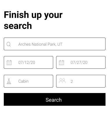
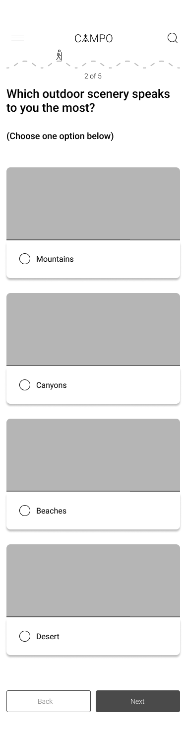
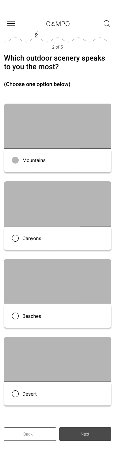
I would prototype and validate the core discovery and booking flows earlier as well. Earlier testing would help identify unnecessary steps before investing heavily in visual design.